Articles
Time and Price
William D. Gann (1878-1955) was a legendary trader who designed several unique techniques for analyzing price charts. He developed a unique combination of precise mathematical and geometric principles which are not easy to grasp. Gann analysts have spent years pouring over old charts and writings in search of Gann’s secret, and there is no end to the number of people who claim to have discovered Gann’s insight and technique that has eluded everyone else. Perhaps someone has discovered it. I am not in a position to appraise all the claims because I am not a Gann expert and have not read Gann’s writings.
Don Hall has published a book and developed a system called Pyrapoint which seems to me to be well founded in Gann principles. The purpose of this article is to take one idea used in Don’s work, and present it from a different approach, and yet arrive at the same useful conclusion. I hope even Don will find my article to be an original insight to substantiate the validity of his work.
Gann’s geometric angles are trend lines drawn from prominent tops or bottoms at certain angles. The most important angle is 45 degrees, which means the line’s slope is one unit of price per unit of time. (Note: Depending of the chart scale used, the line may or may not appear to be plotted at a 45 degree angle.) For years, I thought this is what Gann analysts meant by the phrase ‘squaring time and price.’ However, Don’s Pyrapoint method gave me a new insight, which is: Price = Time squared or P = t ^ 2.
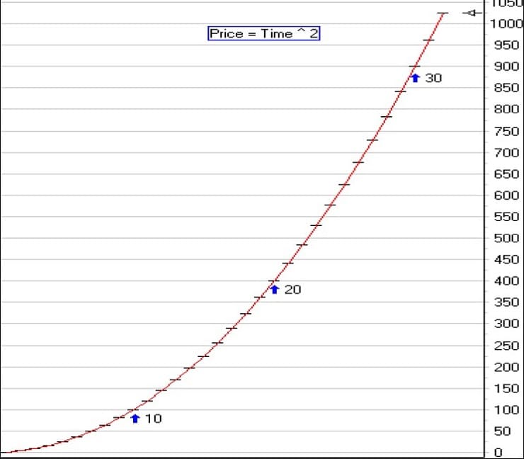
Let me take this mathematical relationship and develop it in this article. The above relationship between price and time can be plotted on a chart as shown in this illustration. The time values of 10, 20, and 30 are marked by the three arrows. See Figure 1.
- Figure 1
- Figure 2
For the sake of illustration, let’s suppose a prominent top or bottom occurs at a price of 400. The theory is that this significant point has a mathematical counterpart. Start a new time curve at this point in time, and it will give us an expectation for a future top or bottom to occur on this curve. This principle can be stated as ‘When price meets time, a change is imminent.’ This ‘price meets time’ relationship is shown in the following chart. See Figure 2.
With the prominent top or bottom at P, if price meets the curve at point A it will do so in 18 bars. The time to A is the square root of the price at A. Price at A is 324. Square root of 324 is 18. If price meets the curve at point B, it will do so in 20 bars. The time to B is the square root of the price at B. Price at B is 400, therefore the time to B is 20 bars. If price meets the curve at point C, it will do so in 22 bars. This is a very interesting concept!
Remember that price and time are related by the formula: P = t ^ 2 or t = sqrt( P ).
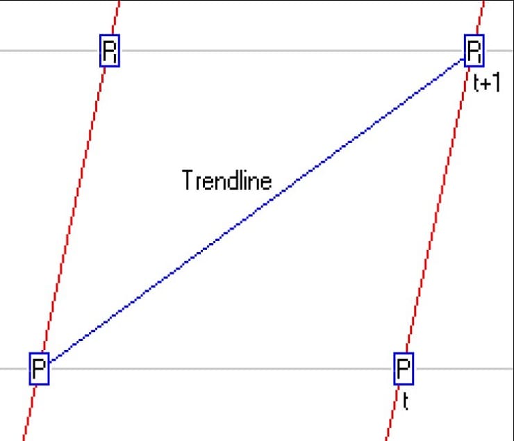
In this article, I will develop the mathematics for the slope of a trend line using the price and time relationship presented in the previous article. Let’s work with the model illustrated in this See Figure 3. From the previous article, the next time curve will be t bars away for a given price P. At a time t+1 price would meet the curve at price P1. Now, lets solve for the slope of the trend line shown in blue which connects P and P1.
- P = t ^ 2
- P1 = (t + 1) ^ 2 = t ^ 2 + 2 t + 1 = P + 2 t + 1
- Slope = (Change in price) / (Change in time)
- Change in price = P1 – P = P + 2 t + 1 – P = 2 t + 1 = 2 t + 2 – 1 = 2 [ t + 1] -1
- Change in time = t + 1
- Therefore, slope of P to P1 is = (2 [ t + 1] – 1) / (t+1) = 2 – 1 / (t+1) = 2 – 1 / sqrt( P1 )
If we normalize all prices to consider three significant digits, then all prices will fall in the range of [100 … 1000]. By substituting the price boundaries into the slope formula, we can get a range of slopes as follows.
- For a P1 of 100, the slope of the up trend line to 100 = 2 – 1 / 10 = 1.9
- For a P1 of 1000, the slope of the up trend line to 1000 = 2 – 1 / 100 = 1.99
- The slope of the up trend line at the midpoint of this price range is 2 – 1 / sqrt(500) = 1.96
- Figure 3
- Figure 4
Let’s call this trend line a 45 degree line because we developed the slope using one unit of price change from P to P1 with one unit of time t. For this 45 degree line, the slope is basically 2. I think this is strong justification as to why Gann used 2 cents as the price grid interval of his daily grain charts. Such a scale layout would naturally give Gann 45 degree angles with a slope of 2 cents per daily bar. I have shown that 2 is the slope of the upward 45 degree trend line that develops from the price and time relationship given by the formula: P = t ^ 2.
One can solve for the slope of the downward trend line from P1 to P to obtain this result:
- Slope of P1 to P = (-2 t – 1) / (t-1) = (-2 [t – 1] – 3 ) / (t-1) = -2 – 3 / (t-1) = -2 – 3 / (sqrt( P ) – 1)
- For a P of 100, the slope of the down trend line to 100 = -2 – 3/9 = -2.33
- For a P of 1000, the slope of the down trend line to 1000 = -2 – 3/99 = -2.03
Again, the slope of the down trend line approaches a value of -2. Therefore, -2 is a good approximation for the slope of a downward 45 degree trend line.
Now I would not bother to give you the mathematics in the previous two articles if I did not find application of this theory in the charts. I used the mathematics given in the first two articles to develop a tool in ESPL which draws horizontal lines at calculated price levels, and nearly vertical time curves at the calculated time intervals. This forms a grid of trapezoids like the previous illustration. (Don Hall calls them ‘squares’.) Diagonal lines connect the corners of the trapezoids to give support and resistance trend lines.
🔍 Master Gann’s Tools – Recommended Ebooks
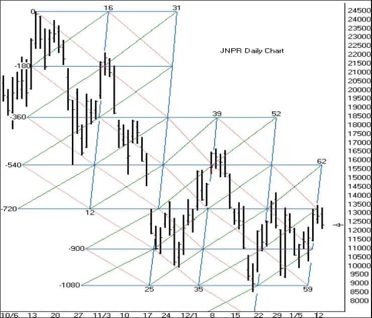
Here is a daily chart of JNPR with the construction started on the highest high. All price levels, time intervals, and trend lines are constructed mathematically from two pieces of information: the price $244.50 on the date 10-16-2000. There is more in this chart than I have space to explain. But, I can point out some characteristics. The horizontal price lines have a label on the left which is a degree of rotation around a Square of 9. This is covered in the Pyrapoint book, but is beyond the scope of this article. Note that in my example, the time lines are nearly vertical. This is a slight variation from the method of construction in the Pyrapoint book which shows vertical lines. I feel that my presentation is appropriate because of the theory of the time curve illustrated in my first article. The time curve forms the left and right sides of the trapezoid, and the price levels form the top and bottom sides.
Time: Time is measured by the time curve, which is related to price. Tip: ‘As price meets time, a change is imminent.’ Note the first time line labeled 12 on the bottom and 16 on the top. If price meets time at the -720 horizontal, then the time for the change would be the 12th bar from the top. If price meets time at the -540 horizontal, then the time for the change would be the 13th bar from the top. At the -360 horizontal, the time change would be in the 14th bar. At the -180 horizontal, the time change would be in the 15th bar. At the 0 line, the time measured would be 16 bars. That is why the top of the time line is labeled with a 16, and the bottom of the line is labeled with a 12. Starting at 16, for each 180 degree down the time count is reduced by one bar, or for every 180 degree rise, the time count increases another bar. Note that the market did experience a change when price met the time curve labeled 12 to 16!
The price at the 12 to 16 time line was used to obtain a forecast of the 2nd time line, which is labeled 25 to 31. As the price meets each time curve, a new time curve is calculated based on the price. Each of the time curves shows excellent correlation with market change when price met the time line. Prices: The prominent high of $24.50 is the calculation basis for all the horizontal price levels that are shown. Tip: The market seeks out these price levels, and you can calculate these prices in advance. Note how the market fell to the -540 horizontal, rallied to the -180 horizontal, fell to the -900 level, rallied to the -540 level, fell to the -1080 level, and rallied to the -720 level.
Trend Lines: The downward 45 degree trend lines shown in red create a fl ow channel, or ‘price highway’ as Don calls it. The upward 45 degree trend lines shown in green create a price highway going the other direction. The red lines are resistance lines that the market must close above to change direction from bearish to bullish. The green lines are support lines that the market must close below to change direction from bullish to bearish. We all have used upward trend lines placed underneath action lows to indicate support, and downward trend lines placed above action highs to indicate resistance. The beauty of this tool is that these diagonal trend lines are computed in advance, and the market seems to have respect for them. Price fl ows up and down the channels. The more you study the example, the more impressed I think you will be with this tool.
The Pyrapoint tool can also be applied to intra-day charts with good success. The size of the price interval used on a daily chart seems to be too big for use on an intra-day chart. No problem. Don points out that there are squares within a square. All one needs to do is sub-divided the price interval into halves, fourths, or eighths. The time interval is determined from price and will not change. One question that I have dealt with is this: If the time interval computes to be 11 bars because the price is at 121, which intra-day bar time frame should I use? If 1-minute bars are used, then we have a time curve 11 minutes later. If 2-minute bars are used, then the time curve would be 22 minutes later. If 5-minute bars are used, then the time curve is plotted 55 minutes later. Now do you see why I have a question? The selection of the intra-day bar time frame greatly affects the time interval measured by the next time curve.
Here is how I tackled the problem, and the proposed solution. I displayed a 1-minute chart and used a cycle tool to measure in hindsight the cycle rhythm from bottoms to bottoms, tops to tops, and/or bottoms to tops. When I found a cycle width that seems to fi t by catching multiple turning points, I note the number of minutes in the cycle. I use this formula to estimate a good intra-day time frame to use.
Intra-day Bar Time Frame = Cycle width in minutes / sqrt( P )
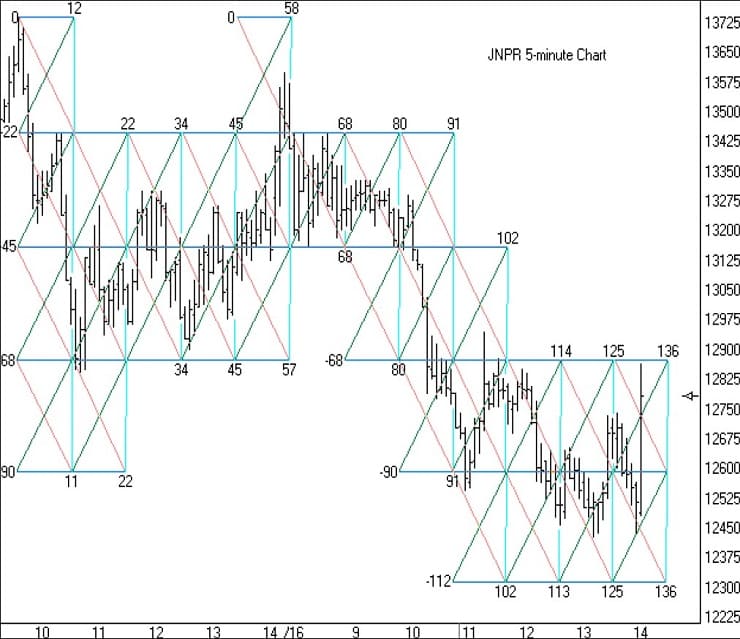
Figure 5
Example: On the JNPR 1-minute chart I found a 65 minute cycle when the price was around $133. Therefore, bar time = 65 / sqrt( 133 ) = 5.6 minutes per bar. So, using a 6-minute chart, or possibly a 5-minute chart should show a good fit with the Pyrapoint tool. I happened to have been following a 5-minute chart, and I do find excellent correlation. I have used a smaller price interval by subdividing the 180 degree interval into eighths in this example. See Figure 5.
Please study the chart, and observe the fl ow of prices in the up and down trend channels. Note how trend changes occur on or near the vertical time curves, and how the market seeks the horizontal price levels. This entire road map is computed in advance from the prominent top that occurred on January 12th at 9:35 a.m.

